UX Ideation and Requirements Workshop for designing with start-ups
Chris HallThe setting
At Geovation we play the role of a start-up accelerator – that means we bring start-ups into our programme and provide them funding and expertise to develop and grow their product and business. When a new start-up joins us, they may be at a different stage of their journey to the last start up I worked with – as such the most important thing as a designer is to bring yourself up to speed with the business and product, their language, their customers and their user needs.
To achieve this, I loosely follow the Google Design Sprint process by providing an initial “Knowledge and Requirements Gathering” workshop with the stakeholders of whatever start-up I’m working with. This allows me to follow the GV concept of getting to tangible results as quickly as possible, whilst leveraging the customer and user research that’s already been undertaken. Getting to tangible results often means getting to user testing as soon as possible, as that’s where most insight is gained.
We teach our members the Business Model Canvas and the Value Proposition Canvas so there is at least some initial user/customer and market research that has been undertaken at the bare minimum, but most start-ups have a good idea of who their customers are, their goals, their user needs, pains, and what problems they’re solving.
Let’s dig into how we get this out onto a whiteboard.
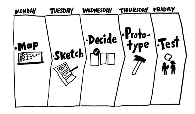
 (Taken from https://medium.muz.li/user-research-is-overrated-6b0fe101d41 - We’re talking about the “Map” day here)
The Workshop
The aim of this workshop is essentially to have a massive initial brain dump, to define our business and user needs, our user pain points and goals, to define some user stories then to finalise, have a quick ideation session based on the outcomes so far which allows us to then define our Minimum Fakeable Product (MFP), and thus also our Minimum Viable Product (MVP).
It’s worth noting, this workshop was born out of the context I work in – start-ups rarely have lots of cash to pay for long design cycles, and often the concept of doing week(s) of initial user research doesn’t align with their goals – usually they’ve already done enough initial research to at least validate their ideas, their users and their market so proposing to re-tread this ground isn’t their top priority - they’re now focusing on building a product to attract further investors or to build a paying user base. As such this workshop aims to bring the user as much as possible into the design process with limited resources (both time and money) – it’s not uncommon to have to deliver a design in a week. The shortest I have used this to deliver a high fidelity prototype so far has been 3 days including the initial day for the workshop.
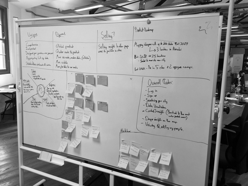
 (This is what our whiteboard looks like when complete. In the future I’m going to print headings to stick up on the board)
The Tools
First of all, the physical tools you need are:
- A whiteboard
- Whiteboard markers
- Post-it notes
- Sharpies
- A TV to plug your laptop into.
And here is the workshop process:
Elevator pitch: This is great to give you a high-level introduction to all aspects of the business, their customers, their customer needs, USPs and competitions. It follows this format:
“Our product is for [insert user group] who needs [insert need], our product [insert product name] is a [insert brief production description] that is [insert brand quality concept]. Unlike [insert competing product name] our product is unique because [insert Unique Selling Point (USP)].”
I type this and leave this on the TV whilst we conduct the rest of the workshop on the whiteboard. This is a super strong tool to kick off with as it clues you in on almost everything immediately and enables you to talk with the stakeholders with familiar terms. From this, you can dig deeper.
Merchandise briefing: Write in columns at the top of the white board the answers to these questions: What’s unique? What’s different? What are you selling and why? What’s the product roadmap?
This is great to dig deeper into the market and the product. What makes them unique? How do they differ from competitors offerings? What products do they want people to buy and why? What is the product roadmap for the future? The answers to these questions help you understand the existing product, the USP, their competitors and the demand for the project now and in the future. It also helps you get to grips with the language of the business too.
10 minute empathy map: Draw this on the left hand side of the board. This is used to drill down into their ideal user and acts as a “light” persona. It gets the stakeholders used to talking in terms of the user, and helps them explore goals and pains, task and feelings, and influences on the user. This helps establish empathy and remind the stakeholders that we design for a user, not for a list of features.
The things you want to capture are: Tasks, Feelings, Influence, Overall Goals, Pain Points.
Now, in an ideal world this empathy map has to be created from real user research. You have to tell your stakeholders this ahead of the workshop to arrive with data, and not to just make any up. They should have this data already if they are following lean start-up principles and have validated their product already. Encourage them to bring this with them.
There is still the risk of introducing assumption, which is why we only create one light “10 minute persona” and don’t spend a lot of time here.
You can read more about these here: https://www.uxpin.com/studio/blog/the-practical-guide-to-empathy-maps-creating-a-10-minute-persona/
Overall goals: You now take your overall goals and write them in a clearer list on the right hand side of the board. You can start to build up a mental picture of what functions will look like here – but try not to “solutionise” just yet. Have a quick brainstorm what other overall goals might look like – but don’t pluck random features from the air. Think about things such as “Log in” and “Signing up”.
User stories: From your overall goals you can write a set of user stories that meet your persona’s goals. I write these on the laptop and display them on the TV. Agreed these with the stakeholders.
“As a (type of user) I want to do (something) so that I can (outcome).”
Content prioritisation: This is a particularly fun part where you can start to “solutionise”! I run this with post-it notes and ask everyone to spend 5 minutes coming up with key features of the application, and to write them on the post-its. Your stakeholders here will go really wild with amazing features they’ve envisioned that will take years of development time, but that’s fine. It’s good to get to know how they see the project evolving. By this point, as the designer, you should have plenty of ideas of how to satisfy your user stories with features. Get them on post-it notes!
Now when the time is up, take it in turns talking one-by-one about the features you’ve come up with. Get them on the whiteboard in the middle. Some people will have the same ideas, great – stack them up. Make sure everyone understands each post-it note.
Now draw a line, or a box to the side and label it “Nice to have” – the language is important, we’re not saying “no” to a feature, we’re just saying “not now, maybe later” – this allows people to be less attached to a particular feature.
It’s time to be ruthless. Really drill down into the features you’ve got to create the minimum you need for a functional experience that satisfies all the work we’ve done up till now.
Does it fit in with the elevator pitch? Does it meet our user goals or relieve a user pain from your persona? If it does neither, it’s probably surplus to requirements. Does it satisfy any user stories? If not, put it into the “Nice to have” area. Really try and work it so you have the absolute minimum required to satisfy your requirements. The rest goes into the “Nice to have”.
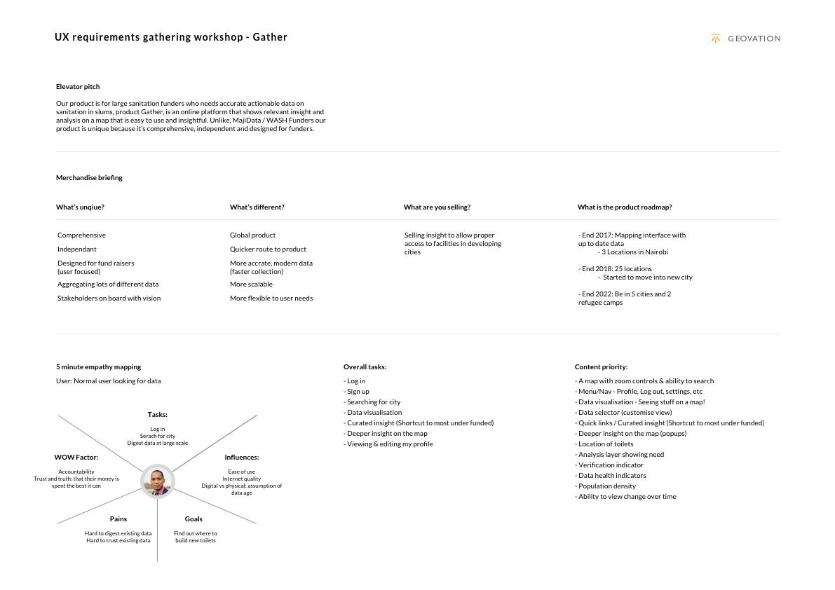
When typed up after the workshop it’ll look like this:
 (The workshop typed up into a document. Notice I haven’t included the “nice to have” box here as there were too many ideas!)
Going forward
This is like a stakeholder interview rolled into a collaborative ideation session. That’s exactly what we’re aiming for. This gives you an excellent base to start sketching, and then start testing within days.
At this stage I sketch on paper and get this in front of Developers and the stakeholders to agree on the technical aspects and to agree on the experience, respectively. These wireframes will often turn into the MVP, especially once you go through another round of stripping out features to create a true MVP.
Finally, I design the high-fidelity UI and work it up into a clickable prototype, to deliver our Minimum Fakeable Product (MFP). These are fantastic as not only can you conduct user testing with a prototype that looks like a fully developed product, but they are also invaluable for investor pitching as they “sell the dream” better than wireframes or ugly technical demos. Of course, if you have a technical demo/MVP built, you want to include that in your pitch with a “this is where we’re going” section for the high-fidelity experience.
Get some usability testing set up, confirm or disprove your assumptions, and then it’s time to iterate on your insight!
Summary
To sum up, I’ve found this workshop fantastic to get the user central to the design process with start-ups that are strapped for time and money, where traditional user research wouldn’t be appropriate. I don’t advocating skipping user research at all, and you have to be upfront about the risks of skipping or making up user research with your start-ups, but this is about working with stakeholders in a collaborative way to bring together knowledge to enable you to get something in front of users as quickly as possible.

Leave a Comment